By Moana Ellis, Local Democracy Reporting
Whanganui District Council has spent more than $60,000 on a new brand after research found most residents could not recall the council’s logo and were unclear about its role.
The rebrand includes $41,800 for brand strategy, design and guidelines and a further $20,000 for templates for stationery, advertising and presentations.
The council says the costs were covered by existing budgets and the new look will be rolled out gradually over the next two to five years.
Interim chief executive Barbara McKerrow said the new design is “fresh, modern and grounded in place”, and is intended to address longstanding confusion about what the council does.
Research in early 2025 found residents generally viewed the council as approachable, but many were unclear about its services and responsibilities. Sixty percent of respondents could not recall the council’s logo, and only 20 percent viewed the long-standing crest positively.
The council’s brand over the past decade has centred on the Whanganui City Council crest, granted in 1955.
Under the new approach, the crest will be separated from the council’s name, restored to its original colours, and reserved for formal governance functions such as the Office of the Mayor.
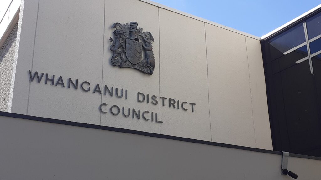
“The symbols and colours within the crest reflect significant moments in the district’s history,” McKerrow says. “But as a primary visual identifier it has limitations. It isn’t well suited to representing the full breadth of what the council does today.
“Over time, this has resulted in the development of more than 20 separate brands for different services and initiatives, creating a complex and confusing identity for the council.”
Communications and marketing manager Sarah Pomeroy said the new brand is designed to bring consistency and reduce duplication across the organisation, and would deliver savings over time.
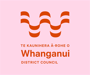
The new tohu (logo) features a stylised form referencing movement and energy, the Whanganui awa and the connections that shape the district, while also forming a distinctive ‘W’. Four colour pairings are used across the brand, drawing on themes such as creativity, celebration, gardens and farms, heritage, forests, the sky and the river.
Pomeroy said the brand better reflects the people who work at the council and the community they serve.
“Most people working at the council live here in this district,” she said. “It’s where we pay rates, raise families, experience the beautiful natural environment, share stories tied to this place and connect with others every day in the community. For a long time, our brand hasn’t reflected this – and it’s also been difficult to apply consistently across the wide range of work the council does.”
The brand strategy and design were delivered by Auckland-based agency Extended Whānau, chosen for its local government experience and previous work on Whanganui’s UNESCO City of Design tohu and the redeveloped Te Whare o Rehua Sarjeant Gallery.
Local expertise was also used to test concepts with community stakeholders, hapū and iwi.
Pomeroy said physical changes such as signage and uniforms will only be updated as items need replacing. Digital platforms including the council website and social media will be updated immediately.
“There’s very little that needs printing in a digital world, and where there is, the stock we have on hand will be used first to minimise waste and expense.”
Awa FM – Te Reo Irirangi o Whanganui
For more of our people, our stories, our way, click News or follow us on Facebook.